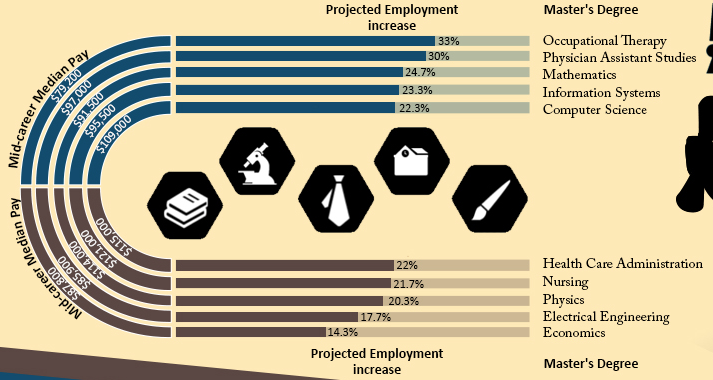
Now, I have stated in the past that I’m a fan of info graphics as a way to make stats and data more consumable.
Of course, like PowerPoint, this is open to abuse by people who don’t quite get it.
It has got so common that someone has dedicated a site to the emerging mayhem – WTF Visualizations http://wtfviz.net/
The common mistakes seem to be:
- Applying the wrong data to an image.
- Mismatching the visual imagery and the data message
- Trying to put too much information into a single visualization.
- Trying to show complex relationships in a single visualization.
- Mixed / unclear messages e.g. putting a mix a causative data and general data in the same visualization.
- Prioritizing a cute/unusual visual metaphor over clarity.

